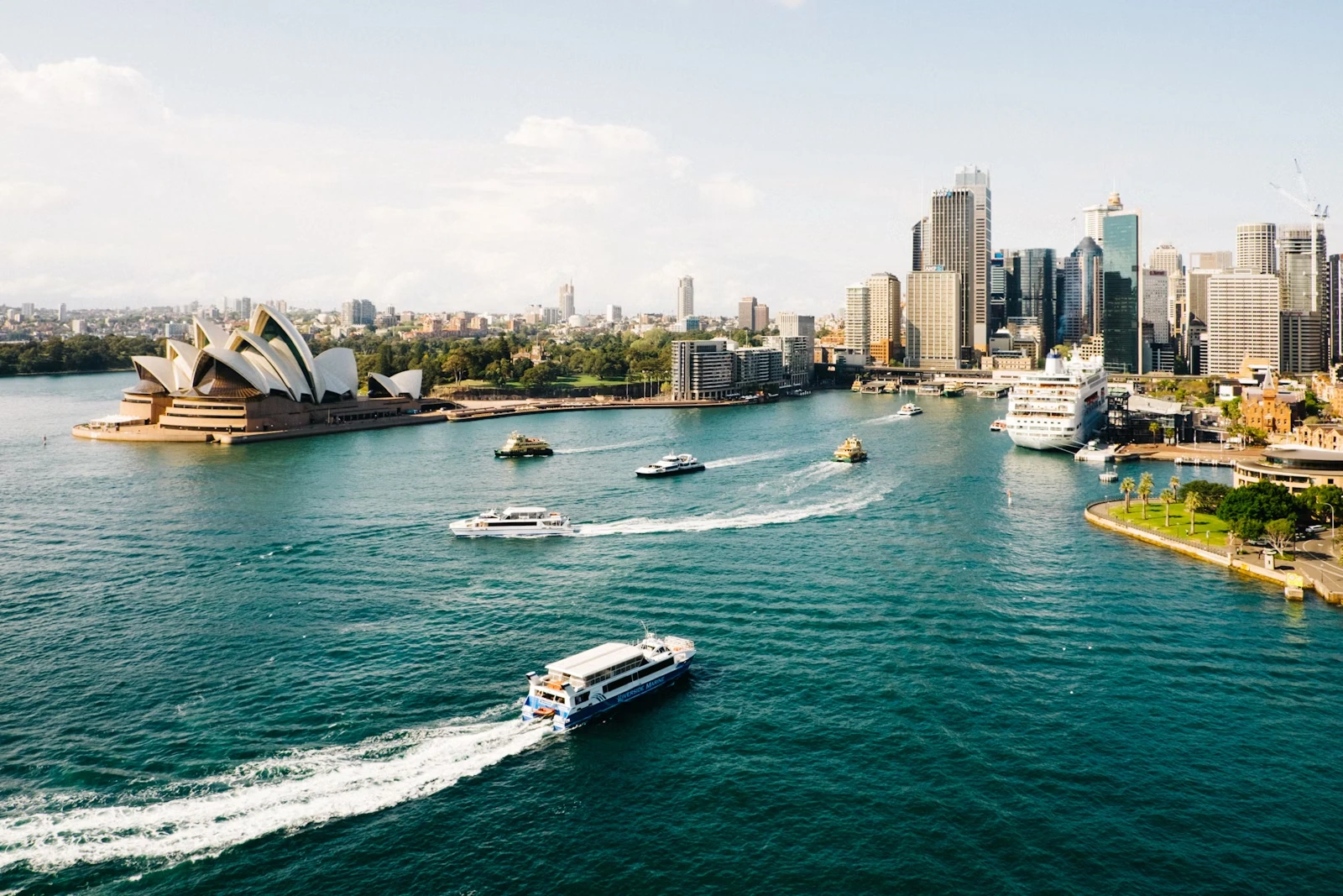
<Image
  src="https://cdn.vortex.design/docs/components/image/sydney.webp"
  alt="Sydney Harbour"
  width="300px"
  height="200px"
  objectFit="cover"
/>
Features
- Supports responsive dimensions and aspect ratios.
- Controls image cropping with
objectFit. - Adds rounded corners and an optional border.
- Shows a fallback image or custom content when loading fails.
Size
Images can have a fixed or responsive width, height, and maxWidth.
import { Image } from "@vortexlabs/vortex";

const imgUrl = "https://cdn.vortex.design/docs/components/image/sydney.webp";

<Image src={imgUrl} width="200px" alt="Sydney Harbour" />
<Image src={imgUrl} height="150px" alt="Sydney Harbour" />
<Image src={imgUrl} width={{ xs: "150px", sm: "250px", lg: "400px" }} alt="Sydney Harbour" />
Object Fit
Controls how the image scales within its container. The default is cover.
<Image src={imgUrl} width="150px" height="150px" objectFit="cover" alt="Sydney Harbour" />
<Image src={imgUrl} width="150px" height="150px" objectFit="contain" alt="Sydney Harbour" />
<Image src={imgUrl} width="150px" height="150px" objectFit="scale-down" alt="Sydney Harbour" />
Border Radius
Six border radius sizes are supported: 2xs, xs, sm, md, lg, and xl.
<Image src={imgUrl} width="120px" height="120px" borderRadius="sm" alt="Sydney Harbour" />
<Image src={imgUrl} width="120px" height="120px" borderRadius="md" alt="Sydney Harbour" />
<Image src={imgUrl} width="120px" height="120px" borderRadius="lg" alt="Sydney Harbour" />
<Image src={imgUrl} width="120px" height="120px" borderRadius="xl" alt="Sydney Harbour" />
Aspect Ratio
Set aspectRatio to the image width divided by its height. It also accepts a breakpoint object.
<Image src={imgUrl} width="300px" aspectRatio={16 / 9} alt="Sydney Harbour" />
<Image src={imgUrl} width="150px" aspectRatio={1} alt="Sydney Harbour" />
Bordered
When bordered is true, a subtle 1px border is added around the image to improve contrast against backgrounds.
<Image src={imgUrl} width="200px" height="150px" alt="Sydney Harbour" />
<Image src={imgUrl} width="200px" height="150px" bordered alt="Sydney Harbour" />
Fallback
Pass an image URL or custom content to fallback. It appears when the image fails to load or src is empty. Custom fallback content needs its own accessible text.
import { Icon, Image, Stack, Text } from "@vortexlabs/vortex";
import { Hexagon } from "@vortexlabs/vortex-icons";

<Stack width="200px" aspectRatio={4 / 3}>
  <Image src="" fallback={imgUrl} alt="Sydney Harbour" />
</Stack>
<Image
  src=""
  width="200px"
  height="150px"
  alt="Sydney Harbour"
  fallback={
    <Stack align="center" gap={2}>
      <Icon src={Hexagon} size="40px" />
      <Text align="center">Sydney Harbour image unavailable</Text>
    </Stack>
  }
/>
A URL fallback keeps alt and sizing, but does not use imageAttributes, objectFit, onLoad, or onError.
Image Attributes
Use imageAttributes for native image options such as loading, decoding, srcSet, and sizes.
With bordered, attributes applies only to the wrapper div, including its ref, id, and styles. Use imageAttributes to target the inner img.
<Image
  src={imgUrl}
  alt="Sydney Harbour"
  imageAttributes={{ loading: "lazy", decoding: "async" }}
/>
Custom Rendering
Use renderImageSlot to render Next.js Image. Forward the supplied attributes to preserve sizing, alternative text, and event handlers.
"use client";

import NextImage from "next/image";
import { Image } from "@vortexlabs/vortex";

export const Photo = () => {
  return (
    <Image
      src="/images/photo.jpg"
      alt="Mountain landscape"
      width="300px"
      renderImageSlot={(attributes) => (
        <NextImage {...attributes} width={1200} height={800} />
      )}
    />
  );
};
Accessibility
alt text for informative images. Use alt="" for decorative images; Image then sets role="presentation".alt. Custom fallback content renders inside a div and must provide its own accessible text.