
All Components

Browse every primitive, component, and hook in the Vortex design system.

Primitives
Container

Layout component that can be used to create a responsive container for your content.

Visibility

Manages responsive visibility and optimizes SSR by using CSS for hiding content.

Icon

Primitive element designed for displaying icons.

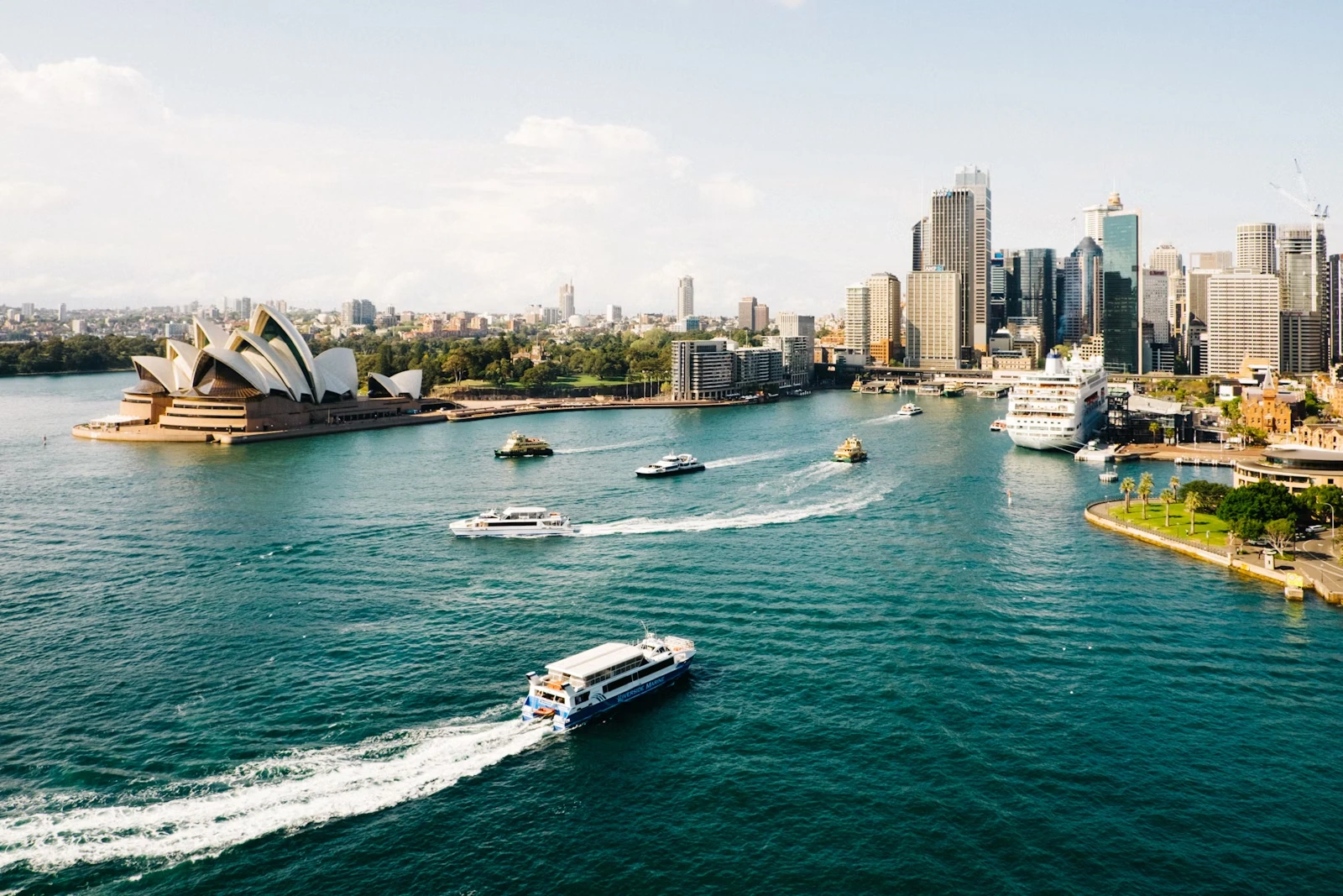
Sydney

Image

Primitive element designed for displaying images.

Interactive

Interactive

Primitive element designed for building clickable and focusable elements.

Vortex Design System

Text

Versatile primitive for rendering text with responsive sizing, semantic colors, and adjustable font weights.

Components

Avatar

Visually represents users or entities, typically displaying an image or a placeholder graphic.

  • Bonnie Hong
  • Ugi Stelmokaitis

Avatar Group

Displays a compact list of user avatars and summarizes additional members with an overflow count.

Badge

Badge

Compact labels used to communicate status, metadata, counts, or short actions.

Button

Button

Widgets that trigger actions like opening a dialog, confirming an action, or initiating a delete operation.

Divider

Component that separates content in a list or section.

Link

Interactive reference to a resource, external or within the current page or application.

⌘K

Shortcut

Displays keyboard shortcuts and key combinations with a semantic kbd element.

Spinner

Visual loading indicator that provides feedback during asynchronous operations.

Hooks

useShortcuts()

useShortcuts

Hook for binding keyboard shortcuts to callbacks and reading whether key combinations are pressed.

useSwitch()

useSwitch

Hook for managing boolean state with helpers to turn the value on, off, or toggle it.