
"use client";

import { CarouselGallery, Image, Stack } from "@vortexlabs/vortex";

const photos = [
  {
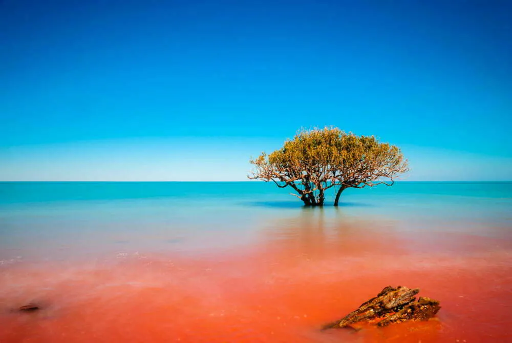
    value: "Broome",
    src: "https://cdn.vortex.design/docs/components/image/broome.webp",
  },
  {
    value: "Sydney",
    src: "https://cdn.vortex.design/docs/components/image/sydney.webp",
  },
  {
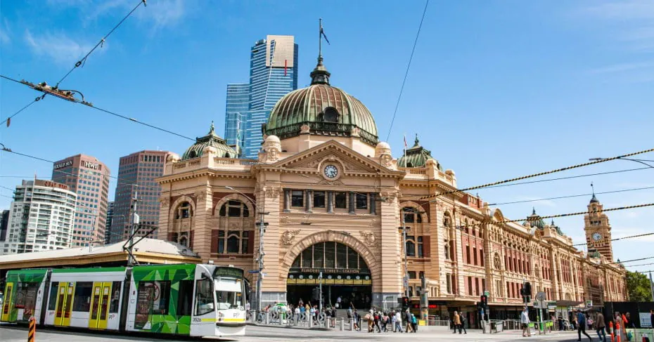
    value: "Melbourne",
    src: "https://cdn.vortex.design/docs/components/image/melbourne.webp",
  },
];

export const CarouselGalleryExample = () => {
  return (
    <Stack width="100%" maxWidth="480px">
      <CarouselGallery ariaLabel="City photos" defaultValue="Sydney">
        <CarouselGallery.Viewport>
          {photos.map((photo) => (
            <CarouselGallery.Item key={photo.value} value={photo.value}>
              <Image
                src={photo.src}
                alt={photo.value}
                width="100%"
                height="320px"
                objectFit="cover"
              />
            </CarouselGallery.Item>
          ))}
          <CarouselGallery.Controls
            previousAriaLabel="Previous photo"
            nextAriaLabel="Next photo"
            size="sm"
          />
          <CarouselGallery.Indicator />
        </CarouselGallery.Viewport>
      </CarouselGallery>
    </Stack>
  );
};
Features
- Shows one item per view and moves one item per step.
- Offers swipe navigation, overlay arrows, indicators, and thumbnails.
- Supports controlled selection, autoplay, and lazy mounting.
- Supports RTL layouts and reduced-motion preferences.
Anatomy
<CarouselGallery ariaLabel="Project photos">
  <CarouselGallery.Viewport>
    <CarouselGallery.Item value="front">Front</CarouselGallery.Item>
    <CarouselGallery.Item value="side">Side</CarouselGallery.Item>
    <CarouselGallery.Controls previousAriaLabel="Previous photo" nextAriaLabel="Next photo" />
    <CarouselGallery.Indicator />
  </CarouselGallery.Viewport>
  <CarouselGallery.Thumbnails ariaLabel="Choose a photo">
    <CarouselGallery.Thumbnail value="front" ariaLabel="Show front">Front</CarouselGallery.Thumbnail>
    <CarouselGallery.Thumbnail value="side" ariaLabel="Show side">Side</CarouselGallery.Thumbnail>
  </CarouselGallery.Thumbnails>
</CarouselGallery>
Component Part
Description
Holds the active item and names the gallery.
Slides between items, one at a time.
Shows one slide, identified by its
value.Moves to the previous or next item with arrows over the slides.
Shows the position of the active item.
Holds the thumbnail picker.
Selects the item with the same
value.Navigation
Each item needs a unique value; defaultValue picks the first one shown. Control selection with value and onChange. Indicator dots only show position, and arrows="hover" shows the arrows on hover or focus.
Showing Broome
"use client";

import { CarouselGallery, Image, Stack, Text } from "@vortexlabs/vortex";
import React from "react";

const photos = [
  {
    value: "Broome",
    src: "https://cdn.vortex.design/docs/components/image/broome.webp",
  },
  {
    value: "Sydney",
    src: "https://cdn.vortex.design/docs/components/image/sydney.webp",
  },
  {
    value: "Melbourne",
    src: "https://cdn.vortex.design/docs/components/image/melbourne.webp",
  },
];

export const CarouselGalleryNavigationExample = () => {
  const [value, setValue] = React.useState("Broome");

  return (
    <Stack width="100%" maxWidth="480px" gap={3}>
      <CarouselGallery
        ariaLabel="Navigation"
        value={value}
        onChange={({ value }) => setValue(value)}
      >
        <CarouselGallery.Viewport>
          {photos.map((photo) => (
            <CarouselGallery.Item key={photo.value} value={photo.value}>
              <Image
                src={photo.src}
                alt={photo.value}
                width="100%"
                height="320px"
                objectFit="cover"
              />
            </CarouselGallery.Item>
          ))}
          <CarouselGallery.Controls
            previousAriaLabel="Previous photo"
            nextAriaLabel="Next photo"
            arrows="hover"
            variant="primary"
            size="sm"
          />
          <CarouselGallery.Indicator />
        </CarouselGallery.Viewport>
      </CarouselGallery>
      <Text>Showing {value}</Text>
    </Stack>
  );
};
Thumbnails
Each Thumbnail is a button matched to an item by value, so don't nest links or buttons. position puts them at the bottom (default) or start, and is responsive.
"use client";

import { CarouselGallery, Image, Stack } from "@vortexlabs/vortex";

const photos = [
  {
    value: "Broome",
    src: "https://cdn.vortex.design/docs/components/image/broome.webp",
  },
  {
    value: "Sydney",
    src: "https://cdn.vortex.design/docs/components/image/sydney.webp",
  },
  {
    value: "Melbourne",
    src: "https://cdn.vortex.design/docs/components/image/melbourne.webp",
  },
];

export const CarouselGalleryThumbnailsExample = () => {
  return (
    <Stack width="100%" maxWidth="640px">
      <CarouselGallery ariaLabel="Thumbnail gallery">
        <CarouselGallery.Viewport>
          {photos.map((photo) => (
            <CarouselGallery.Item key={photo.value} value={photo.value}>
              <Image
                src={photo.src}
                alt={photo.value}
                width="100%"
                height="320px"
                objectFit="cover"
              />
            </CarouselGallery.Item>
          ))}
        </CarouselGallery.Viewport>
        <CarouselGallery.Thumbnails
          ariaLabel="Choose a photo"
          position={{ xs: "bottom", md: "start" }}
        >
          {photos.map((photo) => (
            <CarouselGallery.Thumbnail
              key={photo.value}
              value={photo.value}
              ariaLabel={`Show ${photo.value}`}
              width="64px"
            >
              <Image
                src={photo.src}
                alt=""
                width="100%"
                height="48px"
                objectFit="cover"
              />
            </CarouselGallery.Thumbnail>
          ))}
        </CarouselGallery.Thumbnails>
      </CarouselGallery>
    </Stack>
  );
};
Playback and Lazy Mounting
autoPlay adds a play/pause button and advances every autoPlayInterval milliseconds until the last item. It pauses on hover, offscreen, or in a hidden tab, and stops after user navigation. With reduced motion, it waits for play.
lazyMount mounts items as users reach them. Give placeholder the content's height to avoid layout shift.
"use client";

import { CarouselGallery, Image, Placeholder, Stack } from "@vortexlabs/vortex";

const photos = [
  {
    value: "Broome",
    src: "https://cdn.vortex.design/docs/components/image/broome.webp",
  },
  {
    value: "Sydney",
    src: "https://cdn.vortex.design/docs/components/image/sydney.webp",
  },
  {
    value: "Melbourne",
    src: "https://cdn.vortex.design/docs/components/image/melbourne.webp",
  },
];

export const CarouselGalleryPlaybackExample = () => {
  return (
    <Stack width="100%" maxWidth="480px">
      <CarouselGallery
        ariaLabel="Autoplay"
        autoPlay
        autoPlayInterval={3000}
        playLabel="Play slides"
        pauseLabel="Pause slides"
        lazyMount
      >
        <CarouselGallery.Viewport>
          {photos.map((photo) => (
            <CarouselGallery.Item
              key={photo.value}
              value={photo.value}
              placeholder={
                <Placeholder height="320px" minWidth={0}>
                  Loading photo
                </Placeholder>
              }
            >
              <Image
                src={photo.src}
                alt={photo.value}
                width="100%"
                height="320px"
                objectFit="cover"
              />
            </CarouselGallery.Item>
          ))}
          <CarouselGallery.Indicator />
        </CarouselGallery.Viewport>
      </CarouselGallery>
    </Stack>
  );
};
Accessibility
Key
Description
TabShiftTab
Move forward or backward through focusable elements.
EnterSpace
Activate a focused arrow, thumbnail, or playback button.
Left arrowRight arrow
Move focus between thumbnails when three or more are available.
HomeEnd
Focus the first or last thumbnail when three or more are available.
Announces the visible position after each move, but not during autoplay.
Name the gallery and thumbnails with
ariaLabel, and the arrows with previousAriaLabel and nextAriaLabel.Set
playLabel, pauseLabel, and renderStatusText in non-English apps; their defaults are English.